Interactive Cards Tutorial
Ready for something impressive? Let's build an animated, interactive card gallery that showcases the true power of DrawnUI! You'll create smooth animations, beautiful visual effects, and responsive touch interactions - all with better performance than native controls.
Host support
This article is written as a .NET MAUI XAML walkthrough, but the card composition, gradients, effects, and gesture patterns are also applicable to Blazor.
If you are building the browser version, keep the drawn control tree and host it inside a Razor
Canvascomponent afterUseDrawnUiAsync(...)startup. The current Blazor sandbox reference route iscards.
Blazor host equivalent
For Blazor, the page shell is a Razor component that hosts the card tree directly:
<Canvas Content="_canvasContent"
        WidthRequest="400"
        HeightRequest="760"
        BackgroundColor="#F0F0F5"
        RenderingMode="@RenderingModeType.Accelerated"
        Gestures="@GesturesMode.Enabled" />

@code {
    private readonly SkiaControl _canvasContent = CreateCardsLayout();
}
💡 Prerequisites: Complete Your First DrawnUI App before starting this tutorial.
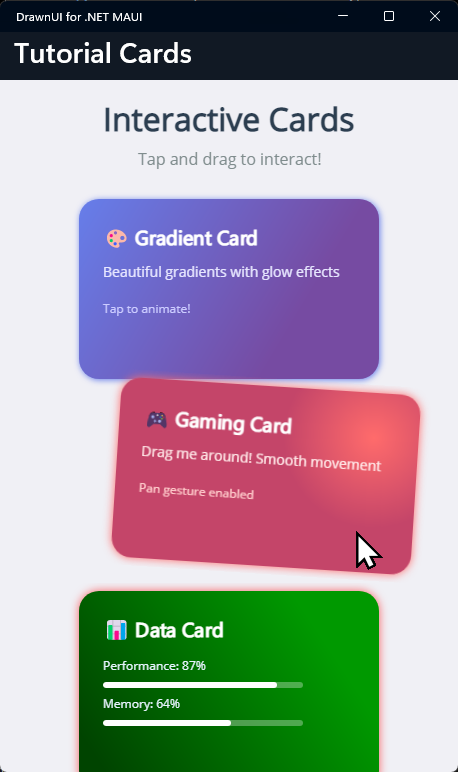
What We're Building
An interactive card gallery featuring:
- 🎨 Beautiful gradient cards with unicode text, controls and gradients
- ✨ Smooth animations (scale, rotation, color changing)
- 👆 Gesture interactions (tap, pan)
- 💫 Visual effects for shadows and glow
Want to see this in action first? Check out the DrawnUI Tutorials Project
Clone the repo and run the Tutorials project to explore all examples!
Step 1: Create & Setup Project
Create New MAUI Project
dotnet new maui -n InteractiveCardsTutorial
cd InteractiveCardsTutorial
Add DrawnUI Package
dotnet add package DrawnUi.Maui
Initialize DrawnUI in MauiProgram.cs
Replace your MauiProgram.cs with this enhanced setup:
using DrawnUi.Infrastructure;

public static class MauiProgram
{
    public static MauiApp CreateMauiApp()
    {
        var builder = MauiApp.CreateBuilder();
        builder
            .UseMauiApp<App>()
            .UseDrawnUi(new DrawnUiStartupSettings
            {
                UseDesktopKeyboard = true,
                DesktopWindow = new()
                {
                    Width = 400,
                    Height = 700
                }
            })
            .ConfigureFonts(fonts =>
            {
                fonts.AddFont("OpenSans-Regular.ttf", "FontText");
                fonts.AddFont("OpenSans-Semibold.ttf", "FontSemibold");
            });

        return builder.Build();
    }
}
💡 Why this setup? We're enabling desktop keyboard support and setting an optimal window size for testing. The DrawnUi startup settings give us better control over rendering performance.
Step 2: Create the UI in XAML
Replace MainPage.xaml with our card gallery:
<?xml version="1.0" encoding="utf-8" ?>
<ContentPage x:Class="InteractiveCardsTutorial.MainPage"
xmlns="http://schemas.microsoft.com/dotnet/2021/maui"
xmlns:x="http://schemas.microsoft.com/winfx/2009/xaml"
xmlns:draw="http://schemas.appomobi.com/drawnUi/2023/draw"
Title="Interactive Cards">
<draw:Canvas
RenderingMode="Accelerated"
Gestures="Enabled"
BackgroundColor="#f0f0f5"
HorizontalOptions="Fill"
VerticalOptions="Fill">
<!-- Main Container -->
<draw:SkiaStack
Spacing="0"
VerticalOptions="Fill">
<!-- Title Section -->
<draw:SkiaLayout Type="Column"
HorizontalOptions="Center"
Margin="16"
UseCache="Image"
Spacing="8">
<draw:SkiaLabel
Text="Interactive Cards"
FontSize="32"
FontAttributes="Bold"
TextColor="#2c3e50"
HorizontalOptions="Center" />
<draw:SkiaLabel
Text="Tap and drag to interact!"
FontSize="16"
TextColor="#7f8c8d"
HorizontalOptions="Center" />
</draw:SkiaLayout>
<!-- Card Gallery -->
<draw:SkiaScroll
IgnoreWrongDirection="True"
VerticalOptions="Fill"
Orientation="Vertical"
Spacing="20">
<draw:SkiaStack Type="Column"
Tag="Cells"
Padding="0,5"
Spacing="0">
<!-- Card 1: Gradient Glow Card -->
<draw:SkiaLayer
Padding="20,8"
UseCache="Image">
<draw:SkiaShape
x:Name="Card1"
Type="Rectangle"
CornerRadius="20"
WidthRequest="300"
HeightRequest="180"
HorizontalOptions="Center"
ConsumeGestures="OnCardGestures">
<!-- Gradient Background -->
<draw:SkiaControl.FillGradient>
<draw:SkiaGradient
Type="Linear"
Angle="45">
<draw:SkiaGradient.Colors>
<Color>#667eea</Color>
<Color>#764ba2</Color>
</draw:SkiaGradient.Colors>
</draw:SkiaGradient>
</draw:SkiaControl.FillGradient>
<!-- Glow Effect -->
<draw:SkiaShape.VisualEffects>
<draw:DropShadowEffect
Color="#667eea"
Blur="3"
X="1"
Y="1" />
</draw:SkiaShape.VisualEffects>
<!-- Card Content -->
<draw:SkiaLayout Type="Column" Margin="24" Spacing="12">
<draw:SkiaRichLabel
Text="🎨 Gradient Card"
FontSize="20"
FontAttributes="Bold"
TextColor="White" />
<draw:SkiaLabel
Text="Beautiful gradients with glow effects"
FontSize="14"
TextColor="#e8e8ff" />
<draw:SkiaLabel
Text="Tap to animate!"
FontSize="12"
TextColor="#ccccff"
Margin="0,8,0,0" />
</draw:SkiaLayout>
</draw:SkiaShape>
</draw:SkiaLayer>
<!-- Card 2: Interactive Gaming Card -->
<draw:SkiaLayer
Padding="20,8"
ZIndex="10"
x:Name="Pannable"
ConsumeGestures="OnCardGestures"
UseCache="Image">
<draw:SkiaShape
x:Name="Card2"
Type="Rectangle"
CornerRadius="20"
WidthRequest="300"
HeightRequest="180"
HorizontalOptions="Center">
<!-- Gaming Theme Background -->
<draw:SkiaShape.FillGradient>
<draw:SkiaGradient
StartXRatio="0.85"
StartYRatio="0.25"
Type="Circular">
<draw:SkiaGradient.Colors>
<Color>#ff6b6b</Color>
<Color>#c44569</Color>
</draw:SkiaGradient.Colors>
</draw:SkiaGradient>
</draw:SkiaShape.FillGradient>
<!-- Gaming Glow -->
<draw:SkiaShape.VisualEffects>
<draw:DropShadowEffect
Color="#ff6b6b"
Blur="5"
X="0"
Y="0" />
</draw:SkiaShape.VisualEffects>
<!-- Gaming Content -->
<draw:SkiaLayout Type="Column" Margin="24" Spacing="12">
<draw:SkiaRichLabel
Text="🎮 Gaming Card"
FontSize="20"
FontAttributes="Bold"
TextColor="White" />
<draw:SkiaLabel
Text="Drag me around! Smooth movement"
FontSize="14"
TextColor="#ffe8e8" />
<draw:SkiaLabel
Text="Pan gesture enabled"
FontSize="12"
TextColor="#ffcccc"
Margin="0,8,0,0" />
</draw:SkiaLayout>
</draw:SkiaShape>
</draw:SkiaLayer>
<!-- Card 3: Data Visualization Card -->
<draw:SkiaLayer
Padding="20,8"
UseCache="Image">
<draw:SkiaShape
Type="Rectangle"
CornerRadius="20"
WidthRequest="300"
HeightRequest="200"
HorizontalOptions="Center"
ConsumeGestures="OnCardGestures">
<!-- Tech Background -->
<draw:SkiaShape.FillGradient>
<draw:SkiaGradient
Type="Linear"
Angle="135">
<draw:SkiaGradient.Colors>
<Color>#004400</Color>
<Color>#009900</Color>
</draw:SkiaGradient.Colors>
</draw:SkiaGradient>
</draw:SkiaShape.FillGradient>
<!-- Tech Glow -->
<draw:SkiaShape.VisualEffects>
<draw:DropShadowEffect
Color="#99ff0000"
Blur="5"
X="0"
Y="0" />
</draw:SkiaShape.VisualEffects>
<!-- Progress Bars -->
<draw:SkiaLayout Type="Column" Margin="24" Spacing="16">
<draw:SkiaRichLabel
Text="📊 Data Card"
FontSize="20"
FontAttributes="Bold"
TextColor="White" />
<!-- Progress Bars -->
<draw:SkiaLayout Type="Column" Spacing="8">
<draw:SkiaLabel Text="Performance: 87%" FontSize="12" TextColor="#e8f4ff" />
<draw:SkiaShape
Type="Rectangle"
CornerRadius="4"
WidthRequest="200"
HeightRequest="6"
BackgroundColor="#50ffffff">
<draw:SkiaShape Type="Rectangle"
CornerRadius="4"
WidthRequest="174"
HeightRequest="6"
BackgroundColor="White"
HorizontalOptions="Start" />
</draw:SkiaShape>
<draw:SkiaLabel Text="Memory: 64%" FontSize="12" TextColor="#e8f4ff" />
<draw:SkiaShape
Type="Rectangle"
CornerRadius="4"
WidthRequest="200"
HeightRequest="6"
BackgroundColor="#50ffffff">
<draw:SkiaShape
Type="Rectangle"
CornerRadius="4"
WidthRequest="128"
HeightRequest="6"
BackgroundColor="White"
HorizontalOptions="Start" />
</draw:SkiaShape>
</draw:SkiaLayout>
</draw:SkiaLayout>
</draw:SkiaShape>
</draw:SkiaLayer>
</draw:SkiaStack>
</draw:SkiaScroll>
</draw:SkiaStack>
</draw:Canvas>
</ContentPage>
🎯 Key Features Demonstrated:
- Gradients: Linear, radial, and angled gradients
- Visual Effects: Drop shadows with custom colors and blur
- Caching: Different strategies for optimal performance
- Layouts: Nested layouts with proper spacing
- Gestures: Tap and pan gesture handling
Step 3: Add Interactive Code
Replace MainPage.xaml.cs with the interaction logic:
using AppoMobi.Gestures;

namespace DrawnUI.Tutorials.InteractiveCards;

public partial class TutorialCards : ContentPage
{
    private readonly HashSet<SkiaControl> _activeTapAnimations = new();

    public TutorialCards()
    {
        try
        {
            InitializeComponent();
        }
        catch (Exception e)
        {
            Super.DisplayException(this, e);
        }
    }

    private void OnCardGestures(object sender, SkiaGesturesInfo e)
    {
        if (sender is not SkiaControl control)
        {
            return;
        }

        if (e.Args.Type == TouchActionResult.Tapped)
        {
            e.Consumed = true;
            _ = AnimateTapAsync(control);
        }

        if (sender == Pannable)
        {
            // Smooth drag following with momentum
            if (e.Args.Type == TouchActionResult.Panning)
            {
                e.Consumed = true;

                control.TranslationX += e.Args.Event.Distance.Delta.X / control.RenderingScale;
                control.TranslationY += e.Args.Event.Distance.Delta.Y / control.RenderingScale;

                // Add subtle rotation based on pan direction
                var deltaX = e.Args.Event.Distance.Total.X / control.RenderingScale;
                var rotationAmount = deltaX * 0.1;
                control.Rotation = Math.Max(-15, Math.Min(15, rotationAmount));
            }
            else if (e.Args.Type == TouchActionResult.Up)
            {
                // Snap back to original position
                control.TranslateToAsync(0, 0, 100, Easing.SpringOut);
                control.RotateToAsync(0, 75, Easing.SpringOut);
            }
        }
    }

    private async Task AnimateTapAsync(SkiaControl control)
    {
        if (!_activeTapAnimations.Add(control))
        {
            return;
        }

        try
        {
            var gradientTask = AnimateGradientAsync(control);

            await control.ScaleToAsync(1.1, 1.1, 150, Easing.CubicOut);
            await control.ScaleToAsync(1.0, 1.0, 200, Easing.BounceOut);
            await control.RotateToAsync(control.Rotation + 2, 200, Easing.SpringOut);
            await control.RotateToAsync(0, 300, Easing.SpringOut);

            await gradientTask;
        }
        finally
        {
            _activeTapAnimations.Remove(control);
        }
    }

    private static async Task AnimateGradientAsync(SkiaControl control)
    {
        // Color pulse effect
        if (control is not SkiaShape shape || shape.FillGradient is not SkiaGradient gradient)
        {
            return;
        }

        var originalStart = gradient.Colors[0];
        var originalEnd = gradient.Colors[1];
        var lighter = 1.5;

        // Brighten colors
        var gradientStartColor = Color.FromRgba(
            Math.Min(1, originalStart.Red * lighter),
            Math.Min(1, originalStart.Green * lighter),
            Math.Min(1, originalStart.Blue * lighter),
            originalStart.Alpha);

        var gradientEndColor = Color.FromRgba(
            Math.Min(1, originalEnd.Red * lighter),
            Math.Min(1, originalEnd.Green * lighter),
            Math.Min(1, originalEnd.Blue * lighter),
            originalEnd.Alpha);

        gradient.Colors = new List<Color>() { gradientStartColor, gradientEndColor };

        // Restore original colors
        await Task.Delay(200);
        gradient.Colors = new List<Color>() { originalStart, originalEnd };
    }
    }
}
⚡ Animation Highlights:
- Scale bounce: Professional elastic scaling effect
- Color pulsing: Dynamic color changes during interaction
- Drag with momentum: Smooth real-time position updates
- Auto snap-back: Spring animations return to rest position
Step 4: Understanding the Technical Details
Let's dive into why certain technical choices were made in this tutorial:
SkiaRichLabel for Unicode Emoji Support
<draw:SkiaRichLabel
    Text="🎨 Gradient Card"
    FontSize="20"
    FontAttributes="Bold"
    TextColor="White" />
Why SkiaRichLabel? Unlike regular SkiaLabel, SkiaRichLabel (formerly SkiaMarkdownLabel) provides:
- Unicode emoji rendering with fallback font support
- Automatic font detection for complex characters like 🎨🖌❤
- Rich text capabilities including markdown formatting
When the font you are using for the FontFamily property doesn't have emoji glyphs, SkiaRichLabel automatically finds and uses appropriate fallback fonts, ensuring your emojis display correctly.
Strategic Caching with UseCache
Each container uses specific caching strategies for optimal performance:
<!-- Static title section -->
<draw:SkiaLayout UseCache="Image" ... >
    <draw:SkiaLabel Text="Interactive Cards" ... />
</draw:SkiaLayout>

<!-- Cards with shadows - cache the entire visual result -->
<draw:SkiaLayer UseCache="Image" ... >
    <draw:SkiaShape>
        <draw:SkiaShape.VisualEffects>
            <draw:DropShadowEffect ... />
        </draw:SkiaShape.VisualEffects>
    </draw:SkiaShape>
</draw:SkiaLayer>
Cache Strategy Explained:
UseCache="Image"- Caches the entire visual result as a bitmap- Used in this tutorial for the title section and card containers
- Essential for shadow effects - shadows are expensive to recalculate every frame
- Used on card containers instead of cards to avoid clipping shadows
Why Cache Shadows?
Drop shadows require complex blur calculations on every frame. Without caching, animating a card with shadows would:
- Recalculate the blur effect for every frame
- Re-render all shadow pixels each frame
- Cause visible stuttering and frame drops
With UseCache="Image", the shadow is calculated once and stored as a bitmap, giving you smooth animations.
Z-Index and Layer Management
<draw:SkiaLayer
    Padding="20,8"
    ZIndex="10"
    x:Name="Pannable"
    ConsumeGestures="OnCardGestures">
Why ZIndex="10"? The draggable card gets higher z-index so it appears above other cards when moved. This creates a natural layering effect during interactions.
Gesture Consumption Strategy
ConsumeGestures="OnCardGestures"
if (e.Args.Type == TouchActionResult.Tapped)
{
    e.Consumed = true; // Prevents gesture bubbling
    // ... animation code
}
Gesture Management:
Notice IgnoreWrongDirection="True" on the SkiaScroll so that it passes horizontal panning to children.
Cards consume their touch events to prevent:
- Scroll interference during card interactions
- Multiple cards responding to the same touch
Gradient Configuration
<draw:SkiaGradient
    Type="Linear"
    Angle="45">
    <draw:SkiaGradient.Colors>
        <Color>#667eea</Color>
        <Color>#764ba2</Color>
    </draw:SkiaGradient.Colors>
</draw:SkiaGradient>
Gradient Types Used:
- Linear with Angle - Traditional diagonal gradients
- Circular with StartXRatio/StartYRatio - Radial gradients positioned off-center for dynamic effects
Animation Performance Patterns
private void OnCardGestures(object sender, SkiaGesturesInfo e)
{
    if (e.Args.Type == TouchActionResult.Tapped)
    {
        e.Consumed = true;
        _ = AnimateTapAsync(control);
    }
}
Animation Pattern:
The gesture handler stays synchronous so e.Consumed = true is applied immediately, while the tap animation itself runs in a dedicated async helper.
The Pattern:
- Synchronous gesture handling - Set
e.Consumed = trueimmediately - Async helper method - Kick off
AnimateTapAsync(control)from the handler - Serialized animation flow - Await scale, rotation, and gradient tasks inside that helper
- Per-card reentry guard - Skip duplicate taps while the same card is already animating
This ensures:
- Gesture consumption works correctly
- Each card finishes one tap animation before starting another
- No gesture conflicts or scroll interference
Easing Functions:
CubicOut- Smooth deceleration for professional feelBounceOut- Playful bounce effect that feels responsiveSpringOut- Natural spring physics for snap-back behaviors
Error Handling Pattern
public MainPage()
{
    try
    {
        InitializeComponent();
    }
    catch (Exception e)
    {
        Super.DisplayException(this, e);
    }
}
Why wrap InitializeComponent in try-catch?
DrawnUI provides developer-friendly error handling through Super.DisplayException(). Instead of your app crashing when you make XAML design mistakes, the error gets displayed directly on the canvas with full stack trace so you can see the issue immediately.
Step 5: Run Your App!
Build and run the app:
dotnet build
dotnet run
What You'll Experience:
- 🎨 Beautiful Cards: Gradient backgrounds with glowing shadows
- ✨ Smooth Animations: interactions that feel native
- 👆 Responsive Touch: Immediate feedback to every gesture
- 🚀 Nice Performance: Cached shadows enable smooth animations
Troubleshooting
Common Issues:
App won't start:
- Ensure you called
.UseDrawnUi()in MauiProgram.cs - Verify .NET 9 is installed
- Check that MAUI workload is installed:
dotnet workload install maui
App not animating:
- Verify gestures are enabled on the Canvas
Performance issues:
- Check that hardware acceleration is enabled
- Use appropriate
UseCachefor your content - Avoid nested animations during heavy interactions
- Profile with platform tools to identify bottlenecks
🎉 Congratulations!
You've built an mpressive first DrawnUI app that demonstrates:
- ✅ Beautiful, pixel-perfect UI
- ✅ Smooth animations
- ✅ Professional visual effects
- ✅ Nice performance
- ✅ Cross-platform consistency
This isn't just "Hello World" - this is what DrawnUI enables you to build!
Ready to create your next amazing app? The DrawnUI community is excited to see what you build! 🚀