Your First DrawnUI App
This quickstart guide will help you create your first DrawnUi.Maui application from scratch in just a few minutes.
Host support
This article is a .NET MAUI XAML tutorial. It assumes a MAUI app host,
DrawnUi.Maui,MauiProgram.cs, and aContentPagecontaining a DrawnUICanvas.If you are building the same idea in Blazor, use Your First DrawnUI App: C# Fluent Syntax for the shared control composition patterns, and host the drawn tree inside a Razor
Canvascomponent afterUseDrawnUiAsync(...)startup. The current Blazor sandbox reference route istutorial-first-app.
🚀 Live Demo in Tutorials Project
Want to see this in action first? Check out the DrawnUI Tutorials Project for:
- First App - This tutorial in action
- Interactive Cards (XAML) - Beautiful animated cards
- Interactive Cards (Code) - Same UI built with C# code-behind
- News Feed Tutorial - Advanced scrolling lists
- Button Tutorial - Game-style interactive buttons
Clone the repo and run the Tutorials project to explore all examples!
🎯 What We'll Build
A simple interactive app featuring:
- 🖼️ Display Logo with proper image handling
- 📝 Styled text labels with different fonts and colors
- 🎮 Interactive button with animations
- 🔄 Hot reload support for rapid development
Prerequisites
- .NET 9 or later
- MAUI 9.0.70 minimum
- Visual Studio 2022 or VS Code with MAUI extension
Step 1: Create a New MAUI Project
dotnet new maui -n MyFirstDrawnApp
cd MyFirstDrawnApp
Step 2: Add DrawnUi Package
dotnet add package DrawnUi.Maui
Step 3: Initialize DrawnUI
Open MauiProgram.cs and add DrawnUi initialization:
public static class MauiProgram
{
    public static MauiApp CreateMauiApp()
    {
        var builder = MauiApp.CreateBuilder();
        builder
            .UseMauiApp<App>()
            .UseDrawnUi() // <-- Add this line
            .ConfigureFonts(fonts =>
            {
                fonts.AddFont("OpenSans-Regular.ttf", "FontText");
            });

        return builder.Build();
    }
}
Step 4: Set Up Default Styles (Optional)
You can set default properties for drawn controls all like you would do it for native.
Add this to Resources/Styles.xaml to set default fonts for all SkiaLabel and SkiaRichLabel controls:
 ...

 <ResourceDictionary
    xmlns="http://schemas.microsoft.com/dotnet/2021/maui"
    xmlns:x="http://schemas.microsoft.com/winfx/2009/xaml"
    xmlns:draw="http://schemas.appomobi.com/drawnUi/2023/draw">

    <Style ApplyToDerivedTypes="True" TargetType="draw:SkiaLabel">
        <Setter Property="TextColor" Value="Black" />
        <Setter Property="FontSize" Value="14" />
        <Setter Property="FontFamily" Value="FontText" />
    </Style>

...
Why set default styles? This lets you define consistent fonts, colors, and sizes across your entire app. Instead of setting FontFamily="FontText" on every SkiaLabel, it's applied automatically!
Step 5: Create Your First Drawn UI
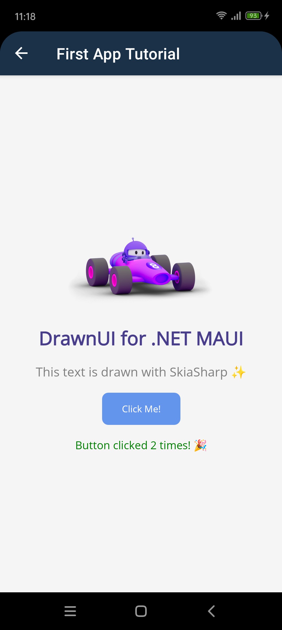
Replace the content of MainPage.xaml:
<?xml version="1.0" encoding="utf-8" ?>
<ContentPage x:Class="MyFirstDrawnApp.MainPage"
             xmlns="http://schemas.microsoft.com/dotnet/2021/maui"
             xmlns:x="http://schemas.microsoft.com/winfx/2009/xaml"
             xmlns:draw="http://schemas.appomobi.com/drawnUi/2023/draw">

    <draw:Canvas
        Gestures="Enabled"
        BackgroundColor="White">

        <draw:SkiaLayout
        Type="Column"
        Padding="40" Spacing="20"
        UseCache="ImageComposite"
        VerticalOptions="Center">

            <draw:SkiaLabel
                UseCache="Operations"
                Text="Welcome to DrawnUI!"
                FontSize="28"
                FontWeight="Bold"
                TextColor="DarkBlue"
                HorizontalOptions="Center" />

            <draw:SkiaRichLabel
                UseCache="Operations"
                Text="This text is drawn with SkiaSharp ✨"
                FontSize="16"
                TextColor="Gray"
                HorizontalOptions="Center" />

            <draw:SkiaButton
                UseCache="Image"
                x:Name="MyButton"
                Text="Click Me!"
                BackgroundColor="CornflowerBlue"
                TextColor="White"
                CornerRadius="8"
                Padding="20,12"
                HorizontalOptions="Center"
                Clicked="OnButtonClicked" />

            <draw:SkiaRichLabel
                UseCache="Operations"
                x:Name="ClickLabel"
                Text="👆 Try clicking the button"
                FontSize="14"
                TextColor="Green"
                HorizontalOptions="Center" />

        </draw:SkiaLayout>
    </draw:Canvas>

</ContentPage>
Technical Notes About This Implementation
Why SkiaRichLabel for Emojis?
<draw:SkiaRichLabel Text="This text is drawn with SkiaSharp ✨" />
<draw:SkiaRichLabel Text="👆 Try clicking the button" />
SkiaRichLabel vs SkiaLabel: For text containing emojis (✨👆), we use SkiaRichLabel because it automatically find an installed font to render all unicode characters. Regular SkiaLabel will not render emojis if your selected font doesn't include emoji glyphs.
Canvas Configuration
<draw:Canvas Gestures="Enabled" BackgroundColor="White">
Key decisions:
Gestures = "Enabled"- Essential! Without this, your SkiaButton won't receive touch events- No hardware acceleration - For simple UIs like this, software rendering is enough and uses less resources than GPU acceleration.
Smart Caching Strategy
<draw:SkiaLayout UseCache="ImageComposite" ... >
    <draw:SkiaLabel UseCache="Operations" ... />
    <draw:SkiaButton UseCache="Image" ... />
    <draw:SkiaRichLabel UseCache="Operations" ... />
Cache types explained:
UseCache="Operations"- For text and simple shapes (very memory efficient)UseCache="Image"- For the button (handles rounded corners and background efficiently)UseCache="ImageComposite"- The whole area will be cached as bitmap and only changed areas (button when clicked) will be redrawn.
This caching setup ensures smooth performance and avoids unnecessary redraws and calculations.
Step 6: Add Button Click Handler
In MainPage.xaml.cs, add the button click handler:
using DrawnUi.Draw;

namespace MyFirstDrawnApp;

public partial class MainPage : ContentPage
{
    private int clickCount = 0;

    public MainPage()
    {
        InitializeComponent();
    }

    private void OnButtonClicked(SkiaButton sender, SkiaGesturesParameters args)
    {
        clickCount++;
        ClickLabel.Text = $"Button clicked {clickCount} times! 🎉";

        // Simple animation
        MyButton.AnimateScaleTo(1.2, 100);
        MyButton.AnimateScaleTo(1.0, 100);
    }
}
Step 7: Run Your App
Build and run your first DrawnUI app:
dotnet build
dotnet run
What You've Learned
Congratulations! You've just created your first DrawnUI app that demonstrates:
- ✅ Canvas: The container that hosts drawn controls
- ✅ SkiaLayout: Layout container for organizing controls
- ✅ SkiaLabel: High-performance text rendering
- ✅ SkiaButton: Interactive button with animations
- ✅ Gestures: Touch handling with smooth animations
Key Differences from Regular MAUI
DrawnUI controls are virtual - they're not native platform controls, but drawn directly on a Skia canvas. This gives you:
- Consistent appearance across all platforms
- Better performance for complex UIs
- Pixel-perfect control over every detail
- Smooth 60fps animations out of the box
Next Steps
Now that you've mastered the basics, you're ready for more exciting projects:
🚀 Ready for More?
- Interactive Card Gallery - Build something impressive with animations and effects!
- Controls Gallery - Explore all available controls
- Getting Started Guide - Deep dive into DrawnUI concepts
📚 Learn More:
- Fluent Extensions - Code-behind UI creation
- Advanced Features - Performance and platform-specific topics
Great job! You've taken your first step into the world of high-performance, pixel-perfect mobile UIs with DrawnUI! 🎉