News Feed Scroller Tutorial
When .NET MAUI CollectionView is not enough.. Think Drawn!
We will be building a news feed scroller with mixed content: text posts, images, videos, articles, ads: an infinite scroll of recycled cells with LoadMore mechanics.
Host support
This article is written as a .NET MAUI tutorial and its code samples use MAUI XAML. The virtualization, recycled-cell, caching, and scrolling patterns are still relevant to Blazor.
If you are building the browser version, keep the drawn layout structure and host it inside a Razor
Canvascomponent afterUseDrawnUiAsync(...)startup. The current Blazor sandbox reference route istutorial-news-feed.
Blazor host equivalent
In Blazor, the page shell becomes a Razor component and the feed layout is hosted directly in Canvas:
<Canvas Content="_canvasContent"
        MaxWidthRequest="430"
        BackgroundColor="#DCDCDC"
        RenderingMode="@RenderingModeType.Accelerated"
        Gestures="@GesturesMode.Lock" />

@code {
    private readonly SkiaControl _canvasContent = new NewsFeedLayout();
}
🚀 This Tutorial Features:
- 🔄 Recycled cells - one cell type handles all content variations with memory efficiency
- 📏 Uneven row heights - because real content isn't uniform!
- ✨ Shadows behind cells - adds visual depth to the interface
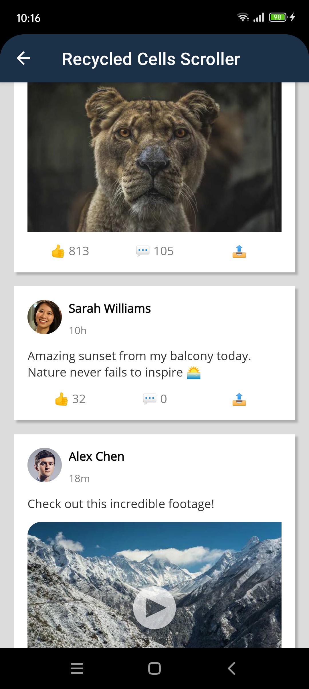
- 🌐 Real internet images for avatars and banners from actual APIs
- 📊 Large dataset handling - measures only visible items at startup, then works in background
- ♾️ Load more functionality - you never know how far users will scroll!
Want to see this in action first? Check out the DrawnUI Tutorials Project
Clone the repo and run the Tutorials project to explore all examples!
🎓 What You'll Learn:
- 🏗️ Smart caching strategies - organize layers to redraw only what changed
- ⚡ Performance optimization - handle thousands of items smoothly
- 🔄 Recycling mastery - one cell type handles all content variations
- 📱 DrawnUI nuances - real-world techniques for building performant UIs
🎯 What We Want to Build
A news feed with mixed content types (text posts, images, videos, articles, ads) using recycled cells for maximum performance. We will be using a combination of SkiaScroll and SkiaLayout to obtain a recycled cells scrolling view. We will also use SkiaDynamicDrawnCell custom control as our cell base. This is optional - you could use any SkiaControl as your cell, but it's a helpful utility for handling BindingContext changes smoothly and provides useful override methods.
⚙️ The Tech Behind
SkiaScroll can scroll any content. When paired with a SkiaLayout it can communicate the viewport size/position to its child and retrieve some information back. With special properties SkiaLayout can act like a bindable item layout, and inside SkiaScroll it can show its full potential with recycling and virtualization! 💪
So what we will do is simply place a SkiaLayout inside the scroll, defining an ItemTemplate and ItemsSource, plus setting some related properties.
Another important point is the data binding for the recycled view - the cell. We'll do it in code-behind for better performance. SkiaDynamicDrawnCell helper provides us with a SetContent method we can override to update the cell content based on the new BindingContext. This code is wrapped by the helper with a batch update lock, so no intermediate rendering happens. We could also override ContextPropertyChanged if we wanted to react to property changes in the bound object (for example IsOnline changing for a person and updating the avatar color to green), but we'll keep this tutorial simple.
We will be using real internet resources to get images for avatars and banners to be realistic with performance. We'll also be using shadow effects for visual appeal. You can display debugging information over the scroll to see displayed/created/measured number of cells along with FPS.
With DrawnUI, we can use a layout as a cell that simply shows or hides elements based on content type - no complex DataTemplateSelector needed! Recycling and height calculation happen automatically ✨
Performance Key Requirements
Stack Optimizations
Let's look at critical SkiaLayout properties for this scenario:
MeasureItemsStrategy="MeasureVisible"
this experimental measurement strategy for SkiaLayout works well for large lists with uneven rows. It measures only visible items initially, then progressively measures off-screen items in the background. This can provide good scrolling performance with thousands of items of varying heights.
ReserveTemplates="10"
The layout views adapter creates new instances of cells only when needed. When a new one is instantiated this can create a UI lag spike. This property indicates that we want it to pre-create a specific number of cells, to avoid a potential lag spike when the user just starts scrolling and new cells are created. This would not be needed for "same size" type of rows, but for "uneven rows" adapter tries to have some reasonable number of cells for different heights to return appropriate one from the pool when requested.
VirtualisationInflated="200"
We are drawing only cells visible inside scrolling viewport, but with double-buffered cache we want cells to start rendering before they enter the viewport, to avoid seeing unrendered content. This property defines how much of the hidden content out of visible bounds should be considered visible for rendering.
Scroll Optimisations
Let's take a look what spices we added to our scroll:
LoadMoreOffset="500"
It would ask content's permission to execute LoadMoreCommand by calling IInsideViewport.ShouldTriggerLoadMore when the user scrolls within 500 points (not pixels) of the end of the content. This allows our stack to make a decision about when to load more data, more specifically it would allow it only if the background measurement of the existing content ended.
FrictionScrolled and ChangeVelocityScrolled
Notice we customized scrolling to stop faster with FrictionScrolled for news feed case where user would read content but help kick swipes with ChangeVelocityScrolled.
Layering
When designing a drawn UI, it's important to think about layering and caching. We know that there would be a static layer with unchanged data, and one that would be redrawn when something changes, for example image gets loaded from internet. In such case we would want to fast-draw static layer from cache and rebuild the dynamic one. Our background has a shadow effect, so we cache it into a separate layer with SkiaShape and draw content on top. If you would want to clip your content with the shape form you would just need to wrap it with a shape of same parameters as the background layer.
    <!--cached background layer with shadow-->
    <draw:SkiaLayout
        UseCache="Image"
        VerticalOptions="Fill"
        HorizontalOptions="Fill"
        x:Name="BackgroundLayer"
        Padding="16,6,16,10">
        <draw:SkiaShape
            CornerRadius="0"
            BackgroundColor="White"
            VerticalOptions="Fill"
            HorizontalOptions="Fill">
            <draw:SkiaShape.VisualEffects>
                <draw:DropShadowEffect
                    Color="#33000000" Blur="3" X="3" Y="3" />
            </draw:SkiaShape.VisualEffects>
        </draw:SkiaShape>
    </draw:SkiaLayout>

    <!--content layer goes here-->
LoadMore Implementation
We want to load data by chunks when the user scrolls, and append them to the existing collection, creating a potentially infinite scroll.
We use an ObservableRangeCollection to hold our news items. This allows us to change collection (UI thread is needed for that) in the middle of the scrolling without resetting the ItemsSource, the stack would pick up our changes automatically.
📱 Implementation
Proceed as described in the Getting Started section. When working on desktop you'll normally want to set your app window to a phone-like size, to be consistent with mobile platforms:
        .UseDrawnUi(new DrawnUiStartupSettings
        {
            DesktopWindow = new()
            {
                Width = 375,
                Height = 800
            }
        })
Define Content Types
We have several possible feed types, we handle all of them with one model. Notice that we didn't implement INotifyPropertyChanged for this example. If your app is updating already existing cells at runtime, for example changing IsUnread for a feed or IsOnline for avatar, you would need to implement it and then override ContextPropertyChanged inside the cell to reflect dynamic changes in model to your UI.
public enum NewsType
{
    Text,
    Image,
    Video,
    Article,
    Ad
}

public class NewsItem
{
    public long Id { get; set; }
    public NewsType Type { get; set; }
    public string Title { get; set; }
    public string Content { get; set; }
    public string ImageUrl { get; set; }
    public string VideoUrl { get; set; }
    public string ArticleUrl { get; set; }
    public string AuthorName { get; set; }
    public string AuthorAvatarUrl { get; set; }
    public DateTime PublishedAt { get; set; }
    public int LikesCount { get; set; }
    public int CommentsCount { get; set; }
}
🪽 Scroll and Stack
These are friends when it comes to creating recycled or "bindable layout-like" scenarios. They interact via IInsideViewport interface that content could implement and is implemented in case of SkiaLayout:
                <draw:SkiaScroll
                    x:Name="NewsScroll"
                    Orientation="Vertical"
                    FrictionScrolled="0.5"
                    ChangeVelocityScrolled="1.35"
                    RefreshCommand="{Binding RefreshCommand}"
                    LoadMoreCommand="{Binding LoadMoreCommand}"
                    RefreshEnabled="True"
                    HorizontalOptions="Fill"
                    VerticalOptions="Fill">

                    <draw:SkiaScroll.Header>

                        <draw:SkiaLayer HeightRequest="40" UseCache="Image">
                            <draw:SkiaRichLabel
                                Text="DrawnUI News Feed Tutorial"
                                HorizontalOptions="Center" VerticalOptions="Center" />
                        </draw:SkiaLayer>

                    </draw:SkiaScroll.Header>

                    <draw:SkiaScroll.Footer>

                        <draw:SkiaLayer HeightRequest="50" />

                    </draw:SkiaScroll.Footer>

                    <draw:SkiaLayout
                        x:Name="NewsStack"
                        Type="Column"
                        ItemsSource="{Binding NewsItems}"
                        RecyclingTemplate="Enabled"
                        MeasureItemsStrategy="MeasureVisible"
                        ReserveTemplates="10"
                        VirtualisationInflated="200"
                        Spacing="0"
                        ItemTemplateType="{x:Type newsFeed:NewsCell}"
                        HorizontalOptions="Fill" />

                </draw:SkiaScroll>
🏗️ Create Your Cell
Caching Strategy Note: For recycled cells
UseCache="ImageDoubleBuffered"is a must - it displays the previous cache while the next one is being prepared in background, allowing smooth scrolling. It supports painting placeholders when no cache is available at all.
Shadow Performance: Shadows are cached in a separate background layer to avoid performance issues. The shadow layer is cached independently from the content.
Spacing Strategy: Stack spacing is set to 0 because the cell margin/padding acts as general spacing between items. If we had no special layer for saving background with shadows you could use Spacing normally, but we need that space for shadows.
<?xml version="1.0" encoding="utf-8"?>

<draw:SkiaDynamicDrawnCell
    x:Class="DrawnUI.Tutorials.NewsFeed.NewsCell"
    xmlns="http://schemas.microsoft.com/dotnet/2021/maui"
    xmlns:x="http://schemas.microsoft.com/winfx/2009/xaml"
    xmlns:draw="http://schemas.appomobi.com/drawnUi/2023/draw"
    xmlns:models="clr-namespace:DrawnUI.Tutorials.NewsFeed.Models"
    HorizontalOptions="Fill"
    x:DataType="models:NewsItem"
    UseCache="ImageDoubleBuffered">

    <!--cached background layer with shadow-->
    <draw:SkiaLayout
        VerticalOptions="Fill"
        HorizontalOptions="Fill"
        UseCache="Image"
        x:Name="BackgroundLayer"
        Padding="16,6,16,10">

        <draw:SkiaShape
            CornerRadius="0"
            BackgroundColor="White"
            VerticalOptions="Fill"
            HorizontalOptions="Fill">

            <draw:SkiaShape.VisualEffects>
                <draw:DropShadowEffect
                    Color="#33000000" Blur="3" X="3" Y="3" />
            </draw:SkiaShape.VisualEffects>

        </draw:SkiaShape>
    </draw:SkiaLayout>

    <draw:SkiaLayout
        Margin="16,6,16,10"
        Padding="16"
        Type="Column" Spacing="12"
        HorizontalOptions="Fill">

        <!-- Author Header -->
        <draw:SkiaLayout Type="Row" Spacing="8"
                         UseCache="Image"
                         HorizontalOptions="Fill">

            <!--avatar image-->
            <draw:SkiaShape
                x:Name="AvatarFrame"
                Type="Circle"
                WidthRequest="40"
                HeightRequest="40"
                BackgroundColor="LightGray">

                <draw:SkiaImage
                    x:Name="AvatarImage"
                    Aspect="AspectFill"
                    HorizontalOptions="Fill"
                    VerticalOptions="Fill" />

            </draw:SkiaShape>

            <!--avatar initials-->
            <draw:SkiaLayout Type="Column"
                             UseCache="Operations"
                             HorizontalOptions="Fill">
                <draw:SkiaLabel
                    x:Name="AuthorLabel"
                    FontSize="14"
                    FontAttributes="Bold"
                    TextColor="Black" />
                <draw:SkiaLabel
                    x:Name="TimeLabel"
                    FontSize="12"
                    TextColor="Gray" />
            </draw:SkiaLayout>
        </draw:SkiaLayout>

        <!-- Content Title -->
        <draw:SkiaRichLabel
            UseCache="Operations"
            x:Name="TitleLabel"
            FontSize="16"
            FontAttributes="Bold"
            TextColor="Black"
            IsVisible="False" />

        <!-- Text Content -->
        <draw:SkiaRichLabel
            UseCache="Operations"
            x:Name="ContentLabel"
            FontSize="14"
            TextColor="#333333"
            LineBreakMode="WordWrap"
            IsVisible="False" />

        <!-- Image Content and optional Play Button -->
        <draw:SkiaShape x:Name="ContentImage"
                        IsVisible="False"
                        CornerRadius="16,0,0,0"
                        HorizontalOptions="Fill"
                        HeightRequest="200">

            <draw:SkiaImage
                BackgroundColor="LightGray"
                x:Name="ContentImg"
                Aspect="AspectCover"
                VerticalOptions="Fill"
                HorizontalOptions="Fill" />

            <draw:SkiaSvg
                x:Name="VideoLayout"
                UseCache="Operations"
                SvgString="{x:StaticResource SvgPlay}"
                WidthRequest="50"
                LockRatio="1"
                TintColor="White"
                Opacity="0.66"
                HorizontalOptions="Center"
                VerticalOptions="Center" />

        </draw:SkiaShape>

        <!-- Article Preview -->
        <draw:SkiaLayout
            HorizontalOptions="Fill"
            UseCache="Image"
            x:Name="ArticleLayout"
            Type="Row"
            Spacing="12"
            IsVisible="False">

            <draw:SkiaShape
                UseCache="Image"
                CornerRadius="8,0,0,8"
                WidthRequest="80"
                HeightRequest="80">
                <draw:SkiaImage
                    HorizontalOptions="Fill"
                    VerticalOptions="Fill"
                    BackgroundColor="LightGray"
                    x:Name="ArticleThumbnail"
                    Aspect="AspectCover" />
            </draw:SkiaShape>

            <draw:SkiaLayout Type="Column" HorizontalOptions="Fill" UseCache="Operations">
                <draw:SkiaLabel
                    x:Name="ArticleTitle"
                    FontSize="14"
                    FontAttributes="Bold"
                    TextColor="Black"
                    LineBreakMode="TailTruncation"
                    MaxLines="2" />
                <draw:SkiaLabel
                    x:Name="ArticleDescription"
                    FontSize="12"
                    TextColor="Gray"
                    LineBreakMode="TailTruncation"
                    MaxLines="3" />
            </draw:SkiaLayout>

        </draw:SkiaLayout>

        <!-- Ad Content -->
        <draw:SkiaShape
            HeightRequest="150"
            BackgroundColor="LightGray"
            HorizontalOptions="Fill"
            UseCache="Image"
            x:Name="AdLayout"
            IsVisible="False">

            <draw:SkiaLabel
                UseCache="Operations"
                Text="Sponsored"
                FontSize="10"
                TextColor="Gray"
                Margin="4,0"
                HorizontalOptions="End" />

            <draw:SkiaImage
                Margin="0,16,0,32"
                UseCache="Image"
                x:Name="AdImage"
                VerticalOptions="Fill"
                HorizontalOptions="Fill"
                Aspect="AspectFill" />

            <draw:SkiaLabel
                VerticalOptions="End"
                UseCache="Operations"
                x:Name="AdTitle"
                FontSize="14"
                Margin="8"
                FontAttributes="Bold"
                MaxLines="1"
                TextColor="Black" />

        </draw:SkiaShape>

        <!-- Interaction Bar -->
        <draw:SkiaLayout Type="Grid"
                         UseCache="Operations"
                         ColumnDefinitions="33*,33*,33*"
                         ColumnSpacing="0"
                         HorizontalOptions="Fill">

            <draw:SkiaRichLabel
                HorizontalOptions="Center"
                Grid.Column="0"
                x:Name="LikeButton"
                Text="👍"
                BackgroundColor="Transparent"
                TextColor="Gray"
                FontSize="14" />

            <draw:SkiaRichLabel
                Grid.Column="1"
                HorizontalOptions="Center"
                x:Name="CommentButton"
                Text="💬"
                BackgroundColor="Transparent"
                TextColor="Gray"
                FontSize="14" />

            <draw:SkiaRichLabel
                Grid.Column="2"
                HorizontalOptions="Center"
                x:Name="ShareButton"
                Text="📤"
                BackgroundColor="Transparent"
                TextColor="Gray"
                FontSize="14" />

        </draw:SkiaLayout>

    </draw:SkiaLayout>

    <!--used for debug Id-->
    <draw:SkiaLabel
        Margin="32,24"
        x:Name="DebugId"
        TextColor="Red"
        HorizontalOptions="End" UseCache="Operations" />

</draw:SkiaDynamicDrawnCell>
You could enable showing debugging information by uncommenting the following code on the sample page, this would give you the idea what is happening with your cells, how much of them you are currently using and have in the pool:
                <draw:SkiaLabel
                    UseCache="Operations"
                    Margin="8"
                    Padding="2"
                    AddMarginBottom="50"
                    BackgroundColor="#CC000000"
                    HorizontalOptions="Start"
                    InputTransparent="True"
                    Text="{Binding Source={x:Reference NewsStack}, Path=DebugString}"
                    TextColor="LawnGreen"
                    VerticalOptions="End"
                    ZIndex="100" />

                <draw:SkiaLabelFps
                    Margin="0,0,4,24"
                    BackgroundColor="DarkRed"
                    HorizontalOptions="End"
                    Rotation="-45"
                    TextColor="White"
                    VerticalOptions="End"
                    ZIndex="100"/>
🧠 Key Concept
- In performance critical scenarios we do not use MAUI bindings, we patch cell properties in one frame from code-behind. Notice we do not need UI thread to access properties of drawn virtual controls. If you need thread-safe bindings use DrawnUI fluent extensions, they provide INotifyPropertyChanged observer pattern that is background thread-friendly.
Core Recycling Pattern
The SetContent method is called every time BindingContext changes for the cell, and it's internally wrapped with batch-update lock, so no intermediate rendering happens, very important for performance.
protected override void SetContent(object ctx)
{
    base.SetContent(ctx);

    if (ctx is NewsItem news)
    {
        ConfigureForContentType(news);
    }
}
Smart Content Configuration
Since we paint what we need instead of using MAUI DataTemplateSelector, we can simply hide/show elements based on content type. The hide/show concept is very efficient with virtual controls, hidden controls do not participate in layout and drawing and since they do not create any native views they affect no pressure.
private void ConfigureForContentType(NewsItem news)
{
    // Reset all content visibility first
    HideAllContent();

    // Configure common elements (author, time, etc.)
    AuthorLabel.Text = news.AuthorName;
    TimeLabel.Text = GetRelativeTime(news.PublishedAt);

    // Then configure based on content type
    switch (news.Type)
    {
        case NewsType.Text:
            ConfigureTextPost(news);
            break;
        case NewsType.Image:
            ConfigureImagePost(news);
            break;
        // ... other types
    }
}
Custom Placeholder Drawing
When using cache type ImageDoubleBuffered we can use DrawPlaceholder method to draw a custom placeholder while the first cache is being prepared in background. Here we simulate an empty cell background layer, we use its existing padding to calculate the exact area. Notice we reuse the SKPaint and it would be disposed when the cell is disposed, instead of creating a new one for each call, keeping the UI-freezing GC collector away as much as possible.
public override void DrawPlaceholder(DrawingContext context)
{
    var margins = BackgroundLayer.Padding;
    var area = new SKRect(
        (float)(context.Destination.Left + margins.Left * context.Scale),
        (float)(context.Destination.Top + margins.Top * context.Scale),
        (float)(context.Destination.Right - margins.Right * context.Scale),
        (float)(context.Destination.Bottom - margins.Bottom * context.Scale));

    PaintPlaceholder ??= new SKPaint
    {
        Color = SKColor.Parse("#FFFFFF"),
        Style = SKPaintStyle.Fill,
    };

    context.Context.Canvas.DrawRect(area, PaintPlaceholder);
}
public override void OnWillDisposeWithChildren()
{
    base.OnWillDisposeWithChildren();
    PaintPlaceholder?.Dispose(); // Clean up SKPaint resources
}
📁 Complete Code: Find the full implementation in the Tutorials project
🌐 Data Provider
Real Avatar Images: Uses RandomUser.me API for 100x100px professional avatars
Real Content Images: Uses Picsum Photos API for high-quality random images
public class NewsDataProvider
{
    private void ConfigureItemByType(NewsItem item)
    {
        switch (item.Type)
        {
            case NewsType.Text:
                item.Content = postTexts[random.Next(postTexts.Length)];
                break;

            case NewsType.Image:
                item.Content = postTexts[random.Next(postTexts.Length)];
                // High-quality random images from Picsum
                item.ImageUrl = $"https://picsum.photos/seed/{index}/600/400";
                break;

            case NewsType.Video:
                item.Title = "Amazing Video Content";
                item.Content = "Check out this incredible footage!";
                // Video thumbnail from Picsum
                item.VideoUrl = $"https://picsum.photos/seed/{index}/600/400";
                break;

            case NewsType.Article:
                item.Title = articleTitles[random.Next(articleTitles.Length)];
                item.Content = articleDescriptions[random.Next(articleDescriptions.Length)];
                item.ImageUrl = $"https://picsum.photos/seed/{index}/400/300";
                item.ArticleUrl = "https://example.com/article";
                break;

            case NewsType.Ad:
                item.Title = "Special Offer - Don't Miss Out!";
                item.Content = "Limited time offer on premium features";
                item.ImageUrl = $"https://picsum.photos/seed/{index}/600/200";
                break;
        }

        // Random engagement numbers
        item.LikesCount = random.Next(0, 1000);
        item.CommentsCount = random.Next(0, 150);
    }

    private NewsType GetRandomNewsType()
    {
        // Weighted distribution for realistic feed
        var typeWeights = new (NewsType type, int weight)[]
        {
            (NewsType.Text, 30),    // 30% text posts
            (NewsType.Image, 40),   // 40% image posts
            (NewsType.Video, 15),   // 15% videos
            (NewsType.Article, 10), // 10% articles
            (NewsType.Ad, 5)        // 5% ads
        };

        var totalWeight = typeWeights.Sum(x => x.weight);
        var randomValue = random.Next(totalWeight);

        var currentWeight = 0;
        foreach (var (type, weight) in typeWeights)
        {
            currentWeight += weight;
            if (randomValue < currentWeight)
                return type;
        }

        return NewsType.Text;
    }

    private (string name, string avatarUrl) GetRandomAuthor()
    {
        return authors[random.Next(authors.Length)];
    }
}
You would see something you'd normally expect in our viewmodel:
public class NewsViewModel : BaseViewModel
{
    public ObservableRangeCollection<NewsItem> NewsItems { get; }

    public ICommand RefreshCommand { get; }
    public ICommand LoadMoreCommand { get; }

    private const int DataChunkSize = 50;

    private async Task RefreshFeed()
    {
        if (IsBusy) return;

        IsBusy = true;

        try
        {
            // Cancel previous preloading
            _preloadCancellation?.Cancel();

            Debug.WriteLine($"Loading news feed !!!");

            // Generate fresh content
            var newItems = _dataProvider.GetNewsFeed(DataChunkSize);

            // Preload images in background (DrawnUI's SkiaImageManager)
            _preloadCancellation = new CancellationTokenSource(TimeSpan.FromSeconds(10));
            _ = PreloadImages(newItems, _preloadCancellation.Token);

            // Update UI - Replace all items for refresh
            MainThread.BeginInvokeOnMainThread(() =>
            {
                NewsItems.Clear();
                NewsItems.AddRange(newItems);
            });
        }
        catch (Exception ex)
        {
            Debug.WriteLine($"Error refreshing feed: {ex.Message}");
        }
        finally
        {
            IsBusy = false;
        }
    }

    private async Task LoadMore()
    {
        if (IsBusy) return;

        IsBusy = true;

        try
        {
            Debug.WriteLine("Loading more items !!!");
            var newItems = _dataProvider.GetNewsFeed(15);

            // Preload new images
            _preloadCancellation = new CancellationTokenSource(TimeSpan.FromSeconds(5));
            _ = PreloadImages(newItems, _preloadCancellation.Token);

            // Add new items to the end of the collection
            MainThread.BeginInvokeOnMainThread(() =>
            {
                NewsItems.AddRange(newItems);
            });
        }
        catch (Exception ex)
        {
            Debug.WriteLine($"Error loading more: {ex.Message}");
        }
        finally
        {
            IsBusy = false;
        }
    }
}
Conclusion
DrawnUI gives you the freedom to just draw what you need. This tutorial demonstrates a challenging real-world scenario:
✅ We Accomplished
- One universal recycled cell handling 5 different content types with uneven heights
- Real internet images from RandomUser.me (avatars) and Picsum Photos (content)
- Image preloading for both avatars and content images using SkiaImageManager
- Smart caching strategy using
UseCache="ImageDoubleBuffered"with MeasureVisible - Shadow performance optimization with separate cached background layer
- Proper LoadMore implementation with
AddRange()vsClear()+AddRange() - Strategic spacing using cell margin/padding instead of stack spacing
- Experimental MeasureVisible strategy for optimal large list performance
- VirtualisationInflated for smoother scrolling with pre-inflated items
- Debug information display for monitoring performance
🎯 Performance Reminders
- Caching:
UseCache="ImageDoubleBuffered"for cells,UseCache="Image"for heavy content,UseCache="Operations"for simple text and vectors. - Layering: Separate UI into layers for caching
- Debug: Monitor how your optimizations affect FPS in real-time to notice drastic difference with and without caching and other techniques.
🚀 The DrawnUI Advantage
A smooth, efficient news feed that handles the challenging case of uneven row heights while loading real images from the internet using recycled cells. Draw what you want! 🎨