Creating Custom Drawn Controls: Game-Style Button Tutorial
We will be building a custom drawn control, using a game-style button as our example.
Host support
This article teaches a shared DrawnUI control pattern. The
GameButtonimplementation itself is not MAUI-specific, but the article currently explains usage mostly in MAUI/XAML terms.If you are building this in Blazor, keep the same control composition and host it inside a Razor
Canvascomponent afterUseDrawnUiAsync(...)startup. The current Blazor sandbox reference route istutorial-custom-button.
Blazor host equivalent
In Blazor, the page shell becomes a Razor component that hosts the drawn content directly:
<Canvas Content="_canvasContent"
        WidthRequest="420"
        HeightRequest="780"
        BackgroundColor="#483D8B"
        RenderingMode="@RenderingModeType.Accelerated"
        Gestures="@GesturesMode.Enabled" />

@code {
    private readonly SkiaControl _canvasContent = CreateCanvasContent();
}
The custom control logic can stay in C# and be reused across MAUI and Blazor as long as it avoids MAUI-only page APIs.
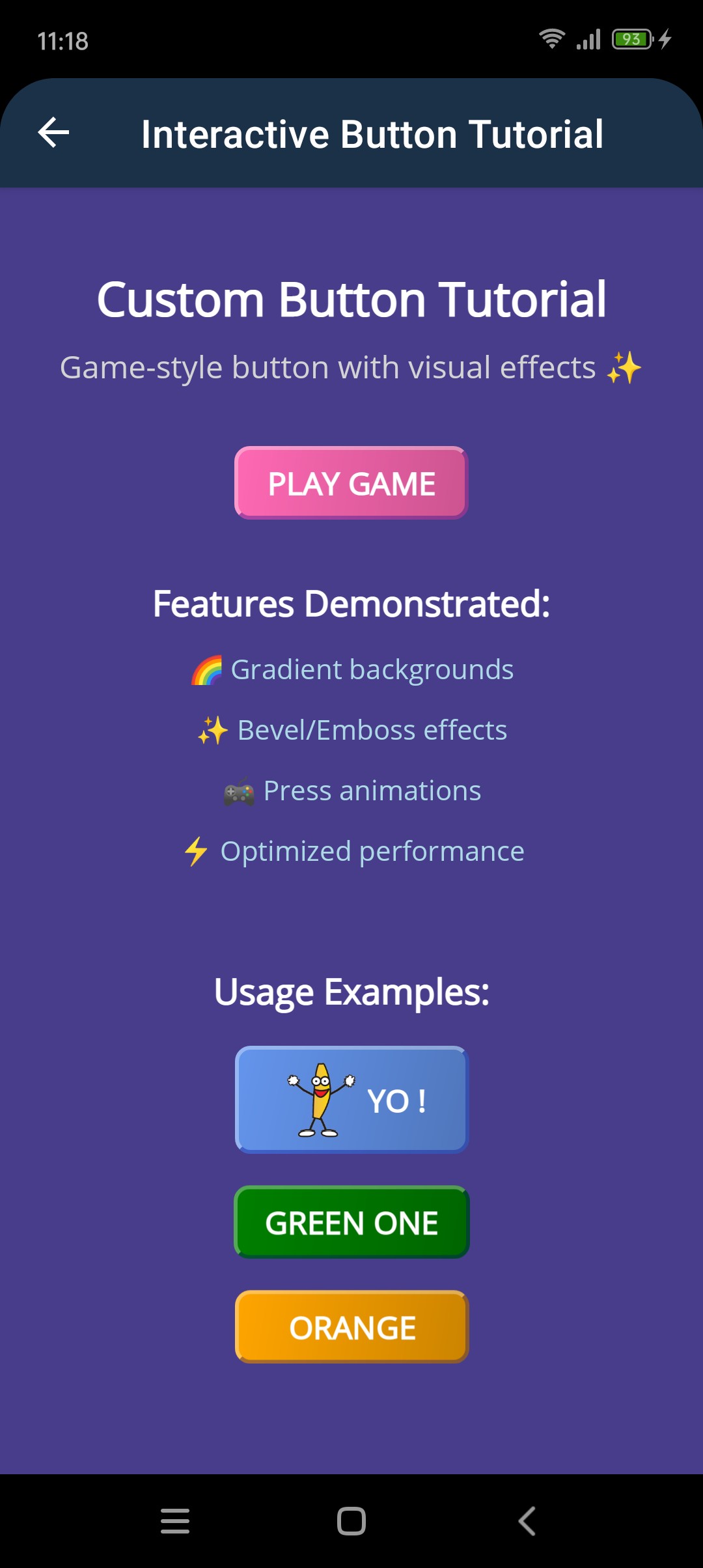
🚀 This Tutorial Features:
- 🏗️ Custom control architecture - extending SkiaLayout
- 🔗 Bindable properties system - creating properties for data binding
- ✨ Advanced visual effects - dynamic bevel/emboss and gradients
- 🖼️ Optional accessory images - support for icons and animated images
- ⚡ Performance optimization - smart caching strategies for faster rendering
Want to see this in action first? Check out the DrawnUI Tutorials Project Clone the repo and run the Tutorials project to explore all examples!
🎓 What You'll Learn:
- 🎮 Game-style UI creation - building controls with depth, lighting, and visual appeal
- 🔧 Property observation patterns - dynamic content updates with ObserveProperty
- 🎯 Interactive feedback systems - implementing realistic press/release animations
- 📱 XAML integration mastery - creating controls that work like built-in MAUI controls
🎯 What We Want to Build
A sophisticated game-style button control that can be used just like any built-in MAUI control. We will create a GameButton class that supports text, optional accessory images, customizable colors, and realistic press animations. The control will work seamlessly in XAML with full IntelliSense support and data binding. We're not styling an existing control but creating entirely new one.
⚙️ The Tech Behind
Custom drawn controls can be created by subclassing any control, base being SkiaControl. For better layout management we extend SkiaLayout that would allow us to easiy layout child controls. You could paint directly on the Canvas, but it's much easier to compose with existing DrawnUI controls.
For bevel/emboss effect and the button base wrapper we would obviously use SkiaShape with its tonns of options for customization. The we would arrange a row stack with image+label inside and react to gestures.
🏗️ Custom Control Architecture
The Foundation Pattern
Our GameButton extends SkiaLayout and uses the CreateDefaultContent() method to build its visual structure:
public class GameButton : SkiaLayout
{
    public GameButton()
    {
        UseCache = SkiaCacheType.Image; // Enable caching for performance
    }

    protected override void CreateDefaultContent()
    {
        base.CreateDefaultContent();

        if (Views.Count == 0)
        {
            AddSubView(CreateView()); // Build our button structure
        }
    }
}
Bindable Properties System
Custom controls need bindable properties to work with XAML and data binding. Here's the pattern:
public static readonly BindableProperty TextProperty = BindableProperty.Create(
    nameof(Text),
    typeof(string),
    typeof(GameButton),
    string.Empty);

public string Text
{
    get { return (string)GetValue(TextProperty); }
    set { SetValue(TextProperty, value); }
}
Property Change Handling
For properties that affect appearance, we respond to changes with callbacks:
public static readonly BindableProperty TintColorProperty = BindableProperty.Create(
    nameof(TintColor),
    typeof(Color),
    typeof(GameButton),
    Colors.HotPink,
    propertyChanged: OnLookChanged); // Callback when property changes

private static void OnLookChanged(BindableObject bindable, object oldValue, object newValue)
{
    if (bindable is GameButton control)
    {
        control.MapProperties(); // Update visual appearance
    }
}
You could react to every property change separately or call common methods that would apply them all in lightweight scenarios.
For our button we would ned to create bindable properties like Text, TintColor, LeftImageSource. You would see that there is much room for enhancing this button, to create your additional properties.
🎨 Building the Visual Structure
Creating the view
We would create our UI in code-behind, in one file, using DrawnUI fluent extensions. Observation methods like ObserveProperty, ObserveProperty and others do not use MAUI bindings but observe INotifyPropertyChanged viewmodels, are thread and leaks safe (subscribtions are released when the subscribing control is disposed).
protected virtual SkiaShape CreateView()
{
    var startColor = TintColor;
    var endColor = TintColor.MakeDarker(20);

    return new SkiaShape()
    {
        UseCache = SkiaCacheType.Image,
        CornerRadius = 8,
        MinimumWidthRequest = 120,
        BackgroundColor = Colors.Black,
        BevelType = BevelType.Bevel,
        Bevel = new SkiaBevel()
        {
            Depth = 2,
            LightColor = Colors.White,
            ShadowColor = Colors.DarkBlue,
            Opacity = 0.33f,
        },
        Children =
        {
            new SkiaLayout()
            {
                Type = LayoutType.Row,
                Margin = new Thickness(16, 8),
                HorizontalOptions = LayoutOptions.Center,
                VerticalOptions = LayoutOptions.Center,
                Spacing = 6,
                Children =
                {
                    // Optional left image (icon)
                    new SkiaMediaImage()
                    {
                        VerticalOptions = LayoutOptions.Center,
                        WidthRequest = 40,
                        Aspect = TransformAspect.AspectFit
                    }.ObserveProperty(this, nameof(LeftImageSource),
                        me =>
                        {
                            me.Source = this.LeftImageSource;
                            me.IsVisible = LeftImageSource != null;
                        }),

                    // Button text
                    new SkiaRichLabel()
                    {
                        Text = this.Text,
                        UseCache = SkiaCacheType.Operations,
                        HorizontalTextAlignment = DrawTextAlignment.Center,
                        VerticalOptions = LayoutOptions.Center,
                        FontSize = 16,
                        FontAttributes = FontAttributes.Bold,
                        TextColor = Colors.White,
                    }.Assign(out TextLabel)
                    .ObserveProperty(this, nameof(Text),
                        me =>
                        {
                            me.Text = this.Text;
                        }),
                }
            }
        },
        FillGradient = new SkiaGradient()
        {
            StartXRatio = 0,
            EndXRatio = 1,
            StartYRatio = 0,
            EndYRatio = 0.5f,
            Colors = new Color[] { startColor, endColor, }
        },
    }.WithGestures((me, args, b) =>
    {
        // Handle touch gestures
        if (args.Type == TouchActionResult.Tapped)
        {
            Clicked?.Invoke(this, EventArgs.Empty);
        }
        else if (args.Type == TouchActionResult.Down)
        {
            SetButtonPressedme;
        }
        else if (args.Type == TouchActionResult.Up)
        {
            SetButtonReleasedme;
            return null; //do not consume UP if not required, so others can receive it
        }

        return me;
    });
}
Property Observation Pattern
Notice how we use the ObserveProperty method to dynamically update child controls when properties change:
.ObserveProperty(this, nameof(Text), me => { me.Text = this.Text; })
This pattern creates a subscription that automatically updates the child control whenever the parent property changes.
🎮 Interactive Feedback System
Visual Press Effects
To create realistic button press feedback, we implement methods that change the visual appearance:
public static void SetButtonPressed(SkiaShape btn)
{
    btn.Children[0].TranslationX = 1.5;
    btn.Children[0].TranslationY = 1.5;
    btn.BevelType = BevelType.Emboss;
}

public static void SetButtonReleased(SkiaShape btn)
{
    btn.Children[0].TranslationX = 0;
    btn.Children[0].TranslationY = 0;
    btn.BevelType = BevelType.Bevel;
}
Dynamic Property Updates
When visual properties like TintColor change, we update multiple visual elements in one method, since it's a virtual control and it would be drawn only once when all these properties change:
private void MapProperties()
{
    if (Control != null)
    {
        DarkColor = this.TintColor.MakeDarker(25);
        Control.Bevel.ShadowColor = DarkColor;
        Control.FillGradient.Colors = new Color[] { TintColor, DarkColor, };
    }
}
📱 XAML Integration
Using Your Custom Control
Once our custom control is created, we can use it in XAML just like any built-in MAUI control:
<ContentPage xmlns="http://schemas.microsoft.com/dotnet/2021/maui"
             xmlns:x="http://schemas.microsoft.com/winfx/2009/xaml"
             xmlns:draw="http://schemas.appomobi.com/drawnUi/2023/draw"
             xmlns:customButton="using:DrawnUI.Tutorials.CustomButton">

    <draw:Canvas BackgroundColor="DarkSlateBlue">
        <draw:SkiaScroll>
            <draw:SkiaStack Spacing="30" Padding="20">

                <!-- Basic button -->
                <customButton:GameButton
                    Text="PLAY GAME"
                    Clicked="ClickedPlay"
                    HorizontalOptions="Center" />

                <!-- Button with custom color and animated GIF -->
                <customButton:GameButton
                    Text="YO !"
                    TintColor="CornflowerBlue"
                    LeftImageSource="Images\banana.gif"
                    Clicked="ClickedBlue"
                    HorizontalOptions="Center" />

            </draw:SkiaStack>
        </draw:SkiaScroll>
    </draw:Canvas>
</ContentPage>
Performance Key Requirements
Caching Strategy
Caching is Critical: For custom controls, proper caching makes the difference between smooth 60fps and laggy performance.
Let's look at the caching approach used in our GameButton:
UseCache = SkiaCacheType.Image for the main control - caches the entire button as a bitmap for fast redrawing.
UseCache = SkiaCacheType.Operations for text labels - caches drawing operations for text rendering.
🚀 Usage Examples
Different Themes
<!-- Green nature theme -->
<customButton:GameButton Text="GREEN ENERGY" TintColor="Green" />

<!-- Orange fire theme -->
<customButton:GameButton Text="FIRE BLAST" TintColor="Orange" />
With Accessory Images
<!-- Button with animated GIF -->
<customButton:GameButton
    Text="ANIMATED FUN"
    TintColor="Purple"
    LeftImageSource="Images\banana.gif" />
🧠 Key Concept
- Think Virtual: Unlike traditional MAUI controls that create native views, drawn controls exist only as drawing instructions. This makes them relatively fast and very flexible - you can create any visual appearance.
- Property-Driven Design: Custom controls should be designed around bindable properties that affect their visual appearance. This makes them work seamlessly with MAUI XAML, data binding, and MVVM patterns.
📁 Complete Code: Find the full implementation in the Tutorials project
Conclusion
DrawnUI gives you the freedom to create exactly the controls you need. This tutorial demonstrates how to build a complete custom control:
✅ We Accomplished
- Complete custom control extending SkiaLayout with proper architecture
- Bindable properties system for Text, TintColor, and LeftImageSource
- Advanced visual effects with 3D bevel effects and dynamic gradients
- Interactive animations with realistic press/release feedback
- Property observation for dynamic content updates
- Performance optimization with smart caching strategies
- XAML integration that works like built-in MAUI controls
- Accessory image support including animated GIFs
🎯 Performance Remainder
- Caching:
UseCache = SkiaCacheType.Imagefor complex controls,UseCache = SkiaCacheType.Operationsfor text and simple graphics. - Virtual Controls: Remember that drawn controls are virtual - they don't create native views, can be accessed on from anythread.
🚀 The DrawnUI Advantage
You can create any UI control you can imagine with complete control over appearance and behavior. Draw what you want! 🎨